Episode 9
Exhibition Design Inspiration (with Tim McNeil)
Show Sponsor
Landslide Creative provides custom website design and development for museums who want to increase their engagement and connect with their visitors, donors, and volunteers. Stop fighting with your website and focus on growing your impact. Visit LandslideCreative.com to learn more.
Show Notes
About the Episode
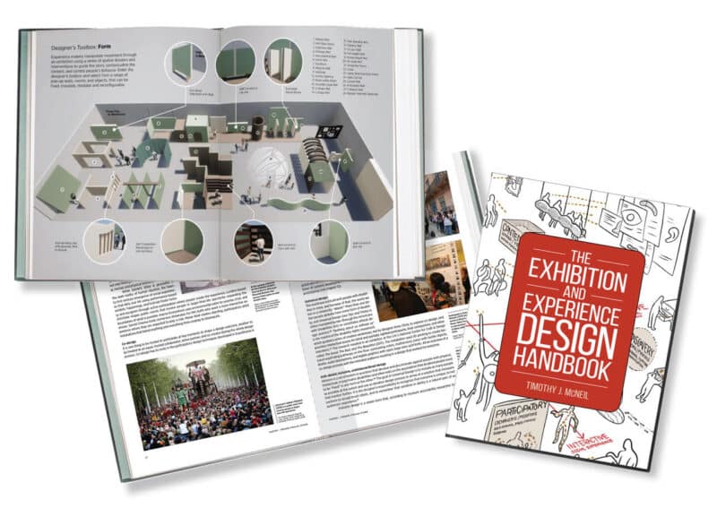
The field of exhibition design may be niche, but the number of museum workers who design and use design principles regularly is vast. So many of us use design to solve problems every day without even realizing it. This episode will warm up and inspire the design part of your brain, whether you’re a full-time exhibition designer, a curator, an educator, or on the marketing team. My guest is Tim McNeil, a Professor of Design at the University of California Davis and Director of the UC Davis Design Museum. Tim has poured his 30 years of design experience into a new book, The Exhibition and Experience Design Handbook, which serves as a jumping-off point for this conversation.
About our Guest
Timothy McNeil is a professor of design and director of the Design Museum at the University of California, Davis. He has spent 30 years as a practicing exhibition designer working for major museums, researching exhibition design history and methods, and teaching the next generations of exhibition design thinkers and practitioners. He contributed to building the J. Paul Getty Museum at the Getty Center and Getty Villa, and the Jan Shrem and Maria Manetti Shrem Museum of Art. His work has been recognized for design excellence by the Society for Experiential Graphic Design and the American Alliance of Museums, and he is the author of The Exhibition and Experience Design Handbook. View more of Tim McNeil’s work in his portfolio.
Links
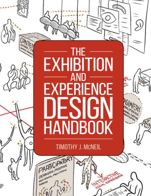
The Exhibition and Experience Design Handbook by Timothy J. McNeil
Transcript
Hannah Hethmon (Narration): Welcome back to We the Museum: a podcast for museum workers who want to form a more perfect institution.
I’m your host, Hannah Hethmon, Owner and Executive Producer at Better Lemon Creative Audio, where I make podcasts for museums, history organizations, and other cultural nonprofits.
In this episode, we’ll be putting on our designer caps and digging into the theory and practical considerations behind great exhibition design. Because this is a subject I don’t personally know much about, I thought it was best to get a guest who not only understands exhibition design but also knows how to communicate what makes exhibits great. I needed a designer and an educator.
Tim McNeil is a Professor of Design at the University of California Davis and Director at the UC Davis Design Museum. He has 30 years of experience designing exhibitions and recently poured all his experience doing and teaching design into a full-color illustrated guide to the subject: The Exhibition and Experience Design Handbook.
I talked to Tim about the history of exhibition design and how to evaluate an exhibit like a designer. We also dug into a few of the key design principles explored in his book and the question of whether or not exhibition design can or should be neutral.
Now, before you decide whether or not this conversation applies to *your* work, let’s have a listen to who Tim is talking about when he says “exhibition designers.”
Timothy McNeil: When I use the term exhibition designers, I use that very loosely because yeah, okay, there are people like me who practice design for their careers. But I also think of the whole museum team as designers, right? The curators to the educators to the collections, people, conservators, everyone’s a designer, right? We’re using design as a way of creating things, of solving problems or putting things together.
Hannah Hethmon (Narration): And before we get on with the episode, I want to shout out our show sponsor, Landslide Creative. This podcast would not be happening without their support. Landslide Creative provides custom website design and development for museums who want to increase their engagement and connect with their visitors, donors, and volunteers. With a custom website designed for the unique needs of your museum, you can stop fighting with your website and focus on growing your impact. Head over to LandslideCreative.com to learn more.
Now let’s get into my conversation with Tim McNeil, Professor of Design and Museum Director at the University of California Davis.
Hannah Hethmon: As a history person, my first concern is, what is the history of this topic? So I was wondering if you could tell me about what you consider the birth of exhibition design, something you touch on in the book, and just some of the key moments or shifts in its development, just some history to frame the rest of the conversation to place this little niche discipline in its timeline.
Timothy McNeil: Yeah, yeah. Okay, where do we begin? It’s a long history, Hannah. You know, clearly, we can go back to, you know, the ancient world, look at the way that markets and public spaces have been designed and created. I mean, to me, exhibitions are everywhere. We’re talking about them within the confines of the location of a museum, potentially, but they’re everywhere, right? We can see them within the retail sector, entertainment sector, and commercial.
If we kind of look at the turn of the century being 1900s and early 1900s, that’s probably when we can see that designers like El Lissitzky, Herbert Bayer, who was associated with the Bauhaus, were invited to design exhibitions by curators or more commercial trade shows or world’s fairs and suddenly the more solitary artist, I suppose to some degree, or designer began to be given control over those spaces. And rather than just having row upon row of display cases or objects, there was now a level of thought going into, okay, how can we make and stage these environments so they’re more dynamic, more interesting? There’s more things that are potentially hands-on rather than hands-off. There are graphics that now are beginning to interpret the objects on a large scale. There’s a lot of thought given into the spatial flow of the exhibition: where people begin, how to pull them through the space in a successful way, and how to convey a narrative through that progression as well.
And beginning from there, taking it through to present day, where we’ve seen clearly a huge shift in the sort of professionalization of the exhibition design field, not only within the museum setting in terms of in-house design teams that have ebbed and flowed, but it’s also the sort of development of the large exhibition design firms.
And then it’s tempting to want to say, right, another major development being clearly advances in digital media, which has revolutionized the exhibition experience and the way museums operate. But I want to see that as a tool; there are a variety of tools, right? And I think more of the advance is the designer being brought into the process as a part of the team to help interpret the information and be part of the educational and learning part of it too.
The basic design principles have really remained kind of the same. But it’s the tools and the technology that’s really changed that’s allowed us to do things in different ways or in new ways or in improved ways.
Hannah Hethmon: So your book is organized around a series of what you call design tropes or principles, these things that as you’re saying have kind of remained consistent over time. And I wanted to start, in those, at the end of the book where you have a design scorecard to kind of evaluate using those principles, evaluate an exhibition. And I thought this was really cool because as I kind of browsed through the book as a non-designer, some things made sense, some where I was like I’d have to sit with this for a while, but I feel like I can take this design card and go into an exhibition and think through why I like it and why I don’t and kind of come out and be able to say something about an exhibition. So I think anyone could use this. And I was wondering—I don’t know if you have your book handy…
Timothy McNeil: I do.
Hannah Hethmon: If we could just run through this rubric and kind of give people these questions to float around and then dig a little deeper into one or two of the principles. So the first category is “Narrative.” So what are the design evaluation questions for narrative?
Timothy McNeil: So under the heading, “Narrative,” and in that section, there are a series of prompts. One of which is, “Did the exhibition allow for lots of different people to get something out of it?” Meaning, was it accessible to a broad audience? And was it, you know, welcoming in the way that it was designed? One of the other questions and other prompts is, “Did the exhibition provide a narrative structure to help make the exhibition concepts clearer?” Again, meaning was there a clear story being told or a narrative that was easy to follow? Sort of more about the content and how that was presented. Then the final question in that particular category is, “Did the marketing for the exhibition influence your experience before and after your visit?” And this gets to this pre-experience and post-exhibition experience and realizing that exhibition design isn’t just about the during, the exhibition itself, but how you build it up at the beginning before anyone even goes there and how you follow with it afterward.
Hannah Hethmon: And then we have “Atmosphere.” So how do we, what questions should we ask about the atmosphere of the exhibition?
Timothy McNeil: Yeah, so this really sets out to talk about the less tangible parts, right, of an experience, maybe those that are more about lighting, about color, about a feeling, about an atmosphere within the exhibition space. It’s important to realize how atmosphere does really dictate our level of engagement and our mood within. an exhibition as well. If we don’t feel comfortable or energized or it’s not got places that are calm or places that are always noisy, that’s going to push some people away or maybe not make them feel as welcome. So atmosphere is more about thinking about the shape of the space, like how it’s designed in terms of its traffic flow or how people move through the space. It’s about how, as I mentioned, lighting and color, temperature, even smell might be used within the exhibition space. It’s more about the senses.
Hannah Hethmon: And you even have a question about safety measures, you know, are they detracting or enhancing from the experience? I thought that was an interesting, very practical component.
Timothy McNeil: Yeah, because often, you know, there’s a real right need for safety within exhibitions, particularly with certain objects, but also just to make sure the experience is a safe one for visitors too. But sometimes that can get in the way of the experience. And one of the biggest challenges as a designer is how do you create these spaces so that there’s a level of security and safety, but at the same time, it doesn’t seem really obvious and apparent. so that it’s intimidating or putting something out for threatening to some people as well.
Hannah Hethmon: And then we have “Spectacle.”
Timothy McNeil: Yes.
Hannah Hethmon: I like that.
Timothy McNeil: Yeah, to me, it’s this idea of a wow moment, right? When you walk into a room and you see something and you literally, your jaw drops and you go, “Wow, that’s amazing.” Exhibitions need wow moments. And it doesn’t mean to say that everything has to be a wow moment, but it needs a few of them sprinkled through. Not only to keep people on their toes and keep them engaged. But just to pull people through the space too, like there’s something to kind of anticipation to look for. So that’s certainly part of the scorecard. Does the exhibition have a series of wow moments?
There’s one here about immersion. “Does the exhibition space take you to a different place? Does it make you feel immersed in a certain topic?” And that level of immersion isn’t about being transported into another world through some kind of technology or through recreating in a space, it can be very simple. Like, did you just lose yourself in an object for a few minutes, right? That’s a form of immersion.
And then this other one is about magic. I really think that exhibition design has a lot to do with sort of, you’re putting on a show, right? It’s got a lot of connections to theater. It has a lot of connections to trickery, meaning that how do you kind of in a good way deceive people that make them think that they’re somewhere that maybe they’re not, or make them believe something that possibly, you know, will lead to something else, or simply to use some kind of device that, again, wows people or makes them go, how did you, how did they do that? How do you make that hologram appear in this thing? Those are things that are important as well about keeping people engaged in the content and the exhibition.
Hannah Hethmon: And then finally, the final category is learning. So questions about how design impacted the learning experience.
Timothy McNeil: Most exhibitions and museums as a whole are spaces to learn, and not in a formal way, but as we know about informal learning within the exhibition space, and that’s definitely part of the designer’s charge is how to create spaces and design spaces to make learning happen.
And I think of learning across a spectrum, from more sort of contemplative passive types of experiences to highly participatory and interactive experiences. And an exhibition can have all of those, it can be more weighted towards one or the other depending on the content, depending on the type of museum it might be in. But it’s great to have a little bit of all of that. just so that there’s something for everybody. It’s about this multimodal form of learning, right? How can we make sure there are different things for how people learn in different ways?
Hannah (Narration): We’ll be right back to my conversation with Tim McNeil, but first, it’s time for a digital minute with Amanda Dyer, Creative Director at Landslide Creative:
Amanda Dyer: Hi, I’m Amanda Dyer, creative Director at Landslide Creative, and I’ve got a quick tip you can use to improve your museum website. Most websites now see the majority of their traffic come from people on mobile devices, but if you’re like me, you typically access your own website on your desktop computer while you’re at work.
That means there could be issues on your mobile site that you haven’t noticed, but your visitors will notice. Take some time to browse your website on your. Try doing common tasks like find your opening hours or current exhibitions, purchase a ticket, renew your membership. Find an upcoming event in register.
Fill out your contact form if you encounter any barriers or moments of frustration while completing these tasks. You’ll know where to focus your efforts. Any updates you make to your mobile site can dramatically improve the user experience. For the majority of your visitors. Get more tips for optimizing your site at landslidecreative.com/mobile.
Hannah (Narration): And back to the episode.
Hannah Hethmon:So I thought maybe we could just like dig into one of the design tropes or principles. So this is author’s choice. If you only get to talk about one on the podcast and then everyone else has to read the book for the rest of them, but kind of dig into one that you like to talk about.
Timothy McNeil: Oh gosh, Hannah, I knew you’d ask that question. Let’s think. One of the chapters I like the most is called “Smoke and Mirrors,” which is about this trickery or illusion with the exhibition space. And this chapter looks at how designers use different techniques to deceive people. And again, I mean that in a positive way. And it’s kind of borrowing from historically, late 18th into the 19th-century forms of illusion from projection onto smoke and plumes of acid, which were pretty dangerous at the time, with magic lantern projectors to early automata. You know, these are the sort of wind-up mechanical clockwork types of characters that were devised in the 18th and 19th century, again to wow audiences, often dressed in various clothes, and they would play instruments and come alive and people thought they were real. So there’s this wonderful sort of world of wonder, as I’ve sort of termed it in that chapter, of these early sort of inventions and forms of illusion and deception that have trickled into contemporary exhibition design.
And they take their form in all of the projection mapping systems we see now, a lot of these digital immersive spaces, like immersive Van Gogh. Some of the spaces we now see where the whole room becomes a program digital environment that can change. Those really have their origins in these early projection systems. And again, we’re using different types of new media and technologies to make those happen, but the basic idea hasn’t changed. It’s about how to, again, create these illusions of things floating within a room or within the space.
Hannah Hethmon: I wonder if you have any examples of what does this kind of smoke and mirrors, this trickery, look like, not the theme parks or the high-budget Van Gogh immersion, but have you gone into smaller mid-size museums, art, or history, and what are the kind of small moments, what does this look like on a small scale, or even on an analog scale?
Timothy McNeil: Yeah, that’s a good question. In fact, I was going to mention Pepper’s Ghost. If anyone’s familiar with that technique, which is simply a way of projecting onto onto a piece of glass, so it appears like the image is floating in front of something. And this is a technique that’s been used for centuries. and is very available and affordable to do in small museum exhibitions, basically have a simple projector and a sheet of glass and you can project anything in front of it. There’s some great examples of that at the Museum of Jurassic Technology in LA do it. I’ve seen it at various history museums where you can project an image of a character on top of a scale model of a ruin to show how people came alive. So that there’s another form projection that is much more doable and more affordable within small to medium museum settings.
Hannah Hethmon: Yeah. In my sector of museum field, I don’t think trickery is something we think about a lot. So I’m hoping people will take that and kind of let it mull in their brain and get them somewhere new.
Timothy McNeil: Yeah. The book, Hannah, one of my goals with it was to try—like I wanted a bit of history. I wanted history in there. I wanted practice, clearly how to design things. But I also wanted some more theory in there too, or to show that there is a logic behind a lot of the things we’re doing.
And from my perspective as an exhibition designer,at one moment we’re talking about this very high conceptual idea for designing an exhibition that’s going to be related to this idea which will hold it all together. And then the next hour we’re talking to an exhibit fabricator about what type of cleat to use on the back of a piece of case work. And I love that about exhibition design, that you get to go from this one end of thinking to a very pragmatic way of thinking too.
And in an exhibition design, you kind of have to know all of this. You have to kind of know how to think conceptually, work with curators, with other people in the museum team to come up with great ideas, to immerse yourself in the content so that you can respond to it and create an exhibition that’s appropriate for the objects of the content. But at the same time, you need to make stuff, right? How something gets built, how to fabricate it, what material is right for this use.
So the book is sort of ranging in that sense. And so the “Smoke and Mirrors” might be more of a higher level concept thinking about creating that. But on a very pragmatic level, one of the chapters is called “Trapped in Glass Boxes,” which is all about how we design casework to protect objects or to display things, which is kind of right at the core of nearly every exhibition that involves objects. We have to have display furniture. So The chapter is called “Trapped in Glass Boxes,” but it’s also an introduction to a bigger sort of thinking about constraints within making exhibitions, right? There are lots of constraints. We’re dealing with the needs of objects and their security. We are dealing with our audiences who are coming through and their safety and their well-being. We’re making sure that things work and don’t break and fall apart. So there’s these constraints you’re always working with. And of course, then there’s always the constraint of time and money, which we’re always working with as well. So how do all of these things come together to create something that works in the end? So “Trapped in Glass boxes,” yes, talks about the design and history of display furniture from its origins to present day, but it’s also a metaphor for how we might feel as designers within exhibitions, where we’re pretty much trapped and trying to figure out how to make the best of what we’ve got or how to do something with very little money or with very little time.
So again, I like it that the chapters have these kinds of extremes to them from thinking big picture, but then getting down to the real details of how to actually do something in a very pragmatic way.
Hannah Hethmon: I guess it’s kind of a course in design thinking, right? So every little aspect, how do you think about it in both this conceptual way and this practical way? How do you take the things that seem objectively just practical— safety, boxes, containers—and think about them in a way in this bigger context of the experience of the exhibition and how they’re going to—maybe they could be a wow factor, right? So. stretching the mind a little bit in that way. Does that sound right?
Timothy McNeil: Yeah, very much so. Yeah, it is all about design thinking, right? Or at least about the process of solving problems through design.
Hannah Hethmon: Yeah. So that leads into what I’m going to have to make the final question because we’ve got so much to talk about, but I’m going to make this the final question. So we’ve all heard about the “museums are not neutral” movement. So with the idea of design to solve problems, is exhibition design neutral? Do you have any thoughts on exhibit design as a political act or a tool for making society a better place?
Timothy McNeil: First off, exhibition design is not neutral. Clearly whoever’s designing is gonna have a perspective or bring a certain set of values or experiences to the table that will slant or push the response or the design response in a certain direction. So I’d certainly start off by saying that, and I also think that exhibition design is an amazing tool for advocacy and for activism and for getting the word out in a way that you can’t do through other mediums. And I don’t think it’s utilized enough for that.
To me, the idea of creating pop-up exhibitions within highly public spaces that are outside of the museum have tremendous potential to activate an audience or to inform the audience about certain topics or certain concerns.
So I feel that the exhibition medium, should say, is underutilized in many ways, and really can be used in very, very powerful ways. Because it’s a space that is inherently social, right? It’s not about an individual consumption like it might be on social media or through certain digital technologies. When you create a physical exhibition and invite people into it, you’re going to bump into other people, hopefully. It’s a place where people come together and that has a very powerful tool in terms of, as I mentioned, advocacy or bringing people together around certain topics or communicating something.
There’s a part in the book within the atmosphere section and also a chapter called “Beyond the White Cube,” which looks at how we’ve—certainly within the art museum setting become very reliant—on what we think of as neutrality, right? That the white cube space—meaning a gallery or an exhibition space that is all white walls, clean and simple—is the best type of space to present contemporary art, for instance. But it’s not neutral, right? It is a message, it is saying something. It is saying that this is a space that is… sort of devoid of personality and in some ways that is detrimental to the works that are on view because those spaces can also be seen as barriers. I’ve learned this from working with my students on this too and going to many exhibitions with them. That’s an off-putting type of space to many people. It’s not welcoming. It’s seen as having connotations around colonialism, around racism, around creating a space that is not like we would do in our homes, right? It’s an alien type of space.
So, getting to the idea of what neutrality is in terms of exhibition design, that white cube space is not it. It is definitely sending a certain message, and I’m advocating for exhibitions and exhibition design to move away from that and to use color, to use texture, to use materials and not be afraid to incorporate those into the exhibition space. but also to make sure that the design of the exhibition space grows out of the content and isn’t seen as superfluous or just, you know, doing for the sake of it, but is rooted within the content that’s been put on view. Let that drive the exhibition design and therefore hopefully create more of a holistic space as what it is too.
There’s also clearly—and the book touches on it too—something about the history of exhibition design being through a very Western lens or Western perspective. We seem to have become afraid also of creating exhibitions that use bright colors or patterns and afraid that they may distract from the objects on view, but often that’s the appropriate space that we should be designing or thinking of. And so yeah, I mean, it’s a topic that’s very relevant to today and being questioned a lot. And I feel very strongly about exhibition design as a tool for expression, not to the detriment of the story being told, but to enhance the story being told and to create welcoming spaces for a whole variety and range of audiences as well.
Hannah Hethmon:
Fantastic. So then finally we have to plug the book.
Timothy McNeil: Yes, the book is called The Exhibition and Experience Design Handbook, and it’s published by the American Alliance of Museums and Rowman and Littlefield Publishers as well. And it’s available online through Rowman and Littlefield’s website.
Hannah Hethmon: And I think—one of the things I was surprised by once I got inside the cover—I got the digital edition, but I think people maybe should buy the physical copy of the book because it’s colorful.
Timothy McNeil: Mm-hmm.
Hannah Hethmon: This won’t surprise anyone after listening to you talk, but there’s full page spreads, there’s lots of color, there are lots of photos, there are lots of images of like sketches and designs. So, you could read start to finish, but there’s also a feeling, I think, that if you just want to browse and just kind of get your brain moving, there’s a lot of spaces you could just stop and read a section and move on and then come back to it. So I think it’d be a good coffee table or desktop book to have to come back to and get inspired when you’re designing.
Timothy McNeil: I’m so, so happy to hear you say that, Hannah. That’s great. That’s exactly how I wanted it to be. I wanted it to be full of full of color and image. I mean, there’s over 250 images in the book. And right from the outset, I couldn’t put a book together about design without having images. It’s very difficult to get away from that. But also, I’m really happy to hear what you said about it being something you can delve into, and then come back to because I really wanted the book to feel like an exhibition in some ways too.
Hannah Hethmon: Hmm, it does,
Timothy McNeil: I kind of thought, how can a book be like an exhibition? We have plenty of exhibitions that try to be books.
Hannah Hethmon: [Laughs] Maybe not as good the other way.
Well, thank you for talking about it and I hope people go out and get a copy or borrow someone else’s copy or steal a copy, you know, whatever they need to do.
Timothy McNeil:
Yeah, thanks so much
Hannah (Narration): Thanks for listening to We the Museum. You’ve been listening to my conversation with Tim McNeil, Professor of Design at the University of California Davis and Director at the UC Davis Design Museum.
For show notes with links to things discussed in this episode and a transcript, visit the show website: WeTheMuseum.com.
You can purchase The Exhibition and Experience Design Handbook through Rowman and Littlefield website, Bookshop.org, Barnes and Noble, and Amazon.
Once again, a big thank you to our show sponsor, Landslide Creative. Making a podcast takes a lot of time and energy, and I wouldn’t be able to set aside the space to make this show without Landslide Creative’s financial support. If your museum is considering a new website, definitely make Landslide Creative your first stop.
Finally, I’ve been your host, Hannah Hethmon. As Owner and Executive Producer at Better Lemon Creative Audio, I help museums around the world plan, produce, and edit podcasts that advance their missions. Find out more about my work at BetterLemonaudio.com